As mid-March approaches, I will be celebrating both my birthday and the 10th anniversary of this blog!
Like everyone (it seems) I've been spending more time on Instagram (windlost1) than on the blog this past year.
I've really missed the ritual of writing. Writing was so very cathartic. I often wrote to help dissect what I was feeling. And it was emotionally-focussing, to distill your thoughts to create a coherent essay.
So while I love the spontaneity of Instagram, I do miss the discipline and clarity of the longer format.
Having said that, Instagram has rekindled my love for photography!
Over the past year on IG, I challenged myself to shoot more carefully and thoughfully and set myself some photo assignments, like this flower series:

Freesia No.1 in Creamer

Freesia No.2 in Pitcher

Flowers in the sink awaiting their vase
I had such fun with this series, shot entirely with my old iPhone4 (which I have only just today replaced).

Apple blossoms from our tree

Snapdragons and urn

Apple blossoms on porcelain
*
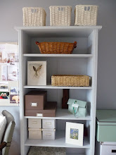
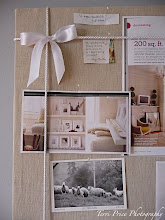
Who would think that learning to edit my photography style would help me to begin editing my thoughts and even my home?
I have lived for 18 years with chronic pain (bad headaches and myofascial neck and back pain) after a horseback riding accident. And I work as a senior engineer in a collaborative but very challenging research environment. So I often find my world very, very overstimulating!
So I began to adopt a sort of serene (#aquietstyle) photography style that is echoing a pull toward serenity in my daily life.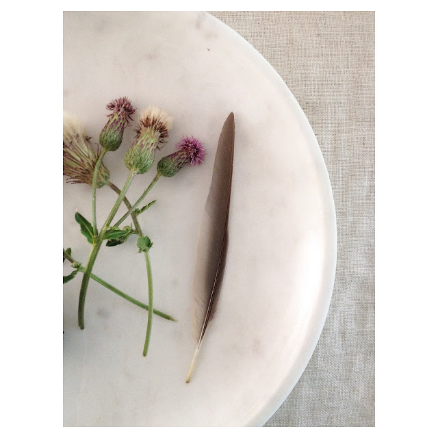

Each day, I am trying to be just a little more quiet, a little more grateful, to take things just a little bit slower (this doesn't always work), and operate a bit more mindfully. I am finally acknowledging my limitations, after 18 years of chronic pain, for the first time...as a chance to be more present and less grasping.
I can't do all the things I used to, nor can I do them in the same quantity.
I have spent years trying though, and have suffered immensely with the loss of my former identity. I still grieve for the person I was.
In the past, I was far more fit (who wouldn't be, exercising 6 days a week...well, I can't do that any more), more achievement-oriented (I was constantly taking evening classes), more caught up in the chaos of the world (trying to help everyone at work, do everything for everyone in my personal life, attend every event I was invited to, and always always staying late at work to polish all the details, etc.).
Now I am choosing to listen to my body more.
To be quiet more. To rest more.
To reflect more. To distill my life down to what really matters.
To still be engaged but to say No more often, and say Yes only to those things that really please me.
I listen to the quiet more.
To be quiet more. To rest more.
To reflect more. To distill my life down to what really matters.
To still be engaged but to say No more often, and say Yes only to those things that really please me.
I listen to the quiet more.

And quietly and slowly, I am finding more kindred spirits who see the world a bit like me. And I'm worrying less about being interesting and charming to everyone.
I worry less if everyone likes me or finds me interesting. What a relief!
 Many years ago, I saw a psychologist to deal with an emotional struggle with a former boyfriend. After several sessions of trying to convince myself that this relationship just needed more work (by me mainly), the psychologist said, "I think you already know the answer." I talked some more and she said again "I think you already know the answer". I think she said it five more times before I realized what she was saying. I did know the answer but was trying to make myself fit into the situation, which didn't fit me. The answer was that things really were not working...FOR ME.
I worry less if everyone likes me or finds me interesting. What a relief!

A light came on. I could suddenly see what I needed, what I knew all along. I ended the relationship.
Oftentimes I think we're spinning so fast that we don't take time to listen any more and see what we really need, at a minimum, to survive and be content. To distill what really brings pleasure, what makes our hearts most happy. We take on too much out of obligation and also out of confusion - we see so much possibility in the world and we want to try and to be everything. We see other people's accomplishments and think that we need to do those things too.
But not everything is meant for you.
Not everything is meant for you.
Not everything is meant for you.
Not everything is meant for you.

But not everything is meant for you.
Not everything is meant for you.
Not everything is meant for you.
Not everything is meant for you.

(I am not perfect at this yet)
I am trying to let go of the things not meant for me. The things I think I should want, or that other people have (which seems to make them happy and popular).
And I am listening more to the things that make me joyful inside, that propel me towards the life that I envision for myself...
I am trying to let go of the things not meant for me. The things I think I should want, or that other people have (which seems to make them happy and popular).
And I am listening more to the things that make me joyful inside, that propel me towards the life that I envision for myself...

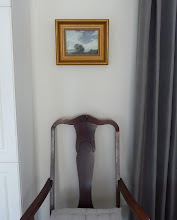
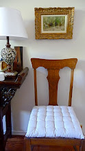
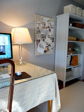
A pretty Provencal painting in my office
I may not be as accomplished, or as slim or as exciting or as fashionably-dressed (or whatever we strive after and call success nowadays) as I once was, or thought I should be.
But I care much less what people think. And I have accomplished a great deal already in my life that makes me proud. I have come farther than I thought I would based on my challenging beginnings.
And I know now that I don't have to attract or please everyone, or appeal to everyone. My success doesn't have to be valued by everyone. I am a great daughter, wife, friend, colleague, and a damn good engineer. And that is not even a tenth of it. It isn't a tenth of any of us who go so much deeper and have grown and learned so much more than others could imagine.
I just want to hear my own thoughts now, in the quiet spaces of the day.
And after hearing them, I want to let them go and stop clinging to definitions of myself. It's hard work. I am trying to shed a complex identity that we all create for ourselves and be left with something simpler and easier to manage. I am tired of being hostage to wants and not-enoughs.
I am starting to feel more clear and content and much more sure of myself than when I was going 100 miles an hour trying to be everything to everyone.
*
Happy 10th Anniversary to me and especially to you, my dear and faithful Readers!!